ADA Sign Requirements for Wisconsin Businesses: A Compliance Checklist
Wisconsin businesses follow the federal 2010 ADA Standards for Accessible Design — the state has no separate ADA sign code that replaces them. In practice, that means permanent rooms and spaces need signs with raised characters and Grade 2 Braille, mounted on the latch side of the door between 48 and 60 inches above the floor, with non-glare finishes and high-contrast lettering. Compliance usually surfaces during building plan review or a tenant fit-out, and getting it wrong means replacing signs after installation.
The ADA Signage Compliance Checklist
Use this as a walk-through reference. Each item is explained in detail further down.
| What to Verify | The Standard | |
| 1 | Tactile sign inventory | Every permanent room and space is identified |
| 2 | Character case and style | Uppercase, sans serif — no script or italic |
| 3 | Character height | 5/8″ minimum to 2″ maximum cap height |
| 4 | Raised depth | Minimum 1/32″ above the sign surface |
| 5 | Braille grade | Grade 2 (contracted) — Grade 1 does not qualify |
| 6 | Braille position | Directly below text, 3/8″ minimum separation |
| 7 | Contrast | Light on dark or dark on light |
| 8 | Finish | Non-glare on both characters and background |
| 9 | Pictogram field | 6″ minimum height where pictograms are used |
| 10 | Mounting wall | Latch side of the door, not on the door |
| 11 | Mounting height | 48″ min / 60″ max to character baselines |
| 12 | Approach clearance | Reachable within 3″ without obstruction |
| 13 | Accessible parking | 60″ minimum from ground to bottom of sign |
| 14 | Plan review | Signage details submitted with your package |
Does Wisconsin Have Its Own ADA Sign Rules?
Not a separate set, no. The Americans with Disabilities Act is federal law, and Title III applies to places of public accommodation and commercial facilities — which covers nearly every business open to the public in Wisconsin.
What Wisconsin adds is the enforcement pathway. The Wisconsin Commercial Building Code incorporates accessibility provisions, and commercial projects generally pass through plan review with the Department of Safety and Professional Services or a delegated municipal authority. That’s typically where signage gets checked before occupancy.
The distinction matters for one practical reason: passing local plan review and being ADA compliant are related but not identical. ADA is enforced federally, largely through complaints and private action, and a sign that slipped past an inspector is still a liability. Treat the building code as your floor, not your ceiling.
Which Signs Actually Need to Be Compliant
This is where most businesses over- or under-buy. Not every sign in your building carries the same obligation.
Signs requiring raised characters and Braille
Any sign identifying a permanent room or space — restrooms, stairwells, exits, room numbers, mechanical and electrical rooms, break rooms, offices with permanent designations. If the space isn’t going anywhere, the sign identifying it needs to be tactile.
Signs requiring visual compliance only
Directional and informational signs — wayfinding, building directories, “Restrooms →” arrows. These need to meet visual character requirements for size, contrast, and finish, but they do not require raised characters or Braille. This surprises people, and it saves money on directory boards.
Signs generally exempt from tactile requirements
Building addresses, company names and logos, temporary signs posted seven days or less, and menus. Occupant names on offices are typically treated as changeable rather than permanent, though the room designation itself still needs to comply.
The Technical Requirements
Character size and style
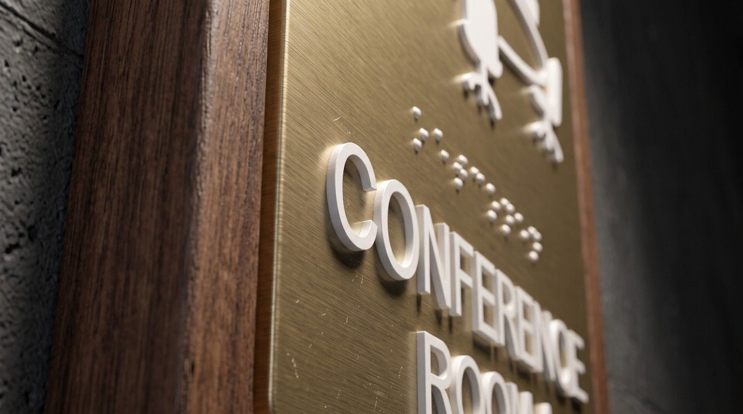
Raised characters must be uppercase, sans serif, with no italic, script, or highly decorative styling. Character height runs a minimum of 5/8 inch and a maximum of 2 inches, measured by the cap height of the uppercase letter “I.” Characters must be raised at least 1/32 inch above the sign surface.
The uppercase requirement catches people off guard — it applies specifically to the tactile characters, not to visual-only signage.
Braille
Grade 2 (contracted) Braille is required, positioned directly below the corresponding raised characters with a minimum separation of 3/8 inch. Braille dots must be domed or rounded, not flat or square. Grade 1 uncontracted Braille does not satisfy the standard.
Contrast and finish
Characters must contrast with their background — either light characters on a dark field or dark characters on a light field. The sign surface and characters must have a non-glare finish. A polished acrylic or mirrored substrate will fail on the glare requirement regardless of how good the contrast is.
The 2010 Standards require contrast without specifying a percentage. A 70% contrast ratio is a widely used industry benchmark and a safe target.
Pictograms
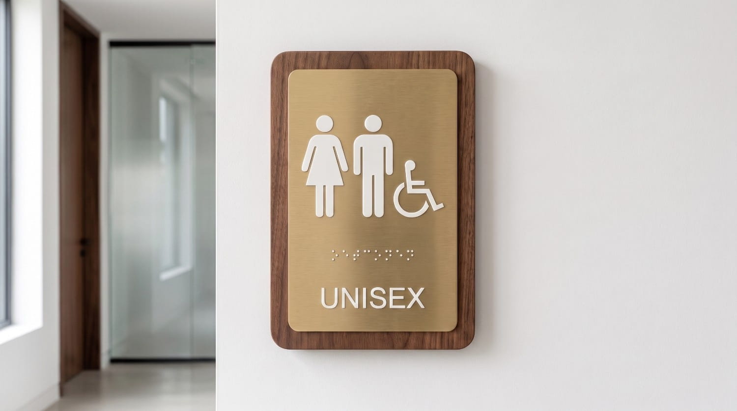
Pictograms are optional, but if you use one, its field must be at least 6 inches high. Text descriptors go below the pictogram field, and the pictogram itself doesn’t need to be tactile — the text below it does.
Worth clearing up a common misconception: the geometric door symbols for restrooms — a circle for women, a triangle for men — are a California Title 24 requirement, not a federal ADA one. Wisconsin businesses find that guidance online constantly and buy signage they don’t need.
Mounting: Where the Sign Goes
Placement fails compliance as often as the sign itself does.
Tactile signs mount on the wall adjacent to the latch side of the door — not on the door. If there’s no wall space on the latch side, use the nearest adjacent wall. For double doors, mount to the right of the right-hand door.
Height is measured to the baseline of the characters: a minimum of 48 inches above the floor to the baseline of the lowest tactile character, and a maximum of 60 inches to the baseline of the highest.
A person must also be able to approach within 3 inches of the sign without walking into the door swing or an obstruction. Overhead and suspended signs need 80 inches minimum clearance from the floor, with characters at least 3 inches tall.
Accessible Parking Signage
Parking gets cited frequently and is easy to fix. Each accessible space needs a sign displaying the International Symbol of Accessibility, mounted so the bottom of the sign is at least 60 inches above the ground — high enough to stay visible when a vehicle is parked in the space. Van-accessible spaces require an additional “Van Accessible” designation.
Common Mistakes We See
- Braille placed beside the text instead of below it — a fabrication error that fails inspection outright
- Grade 1 Braille used in place of contracted Grade 2
- Glossy or mirrored finishes that satisfy contrast but fail the non-glare requirement
- Signs mounted on the door rather than the latch-side wall
- Height measured to the sign edge instead of the character baseline
- Buying tactile signage for directories that only need visual compliance
- Retrofitting after installation, which costs substantially more than specifying correctly upfront
Get Your ADA Signage Right the First Time
Milwaukee Sign Company fabricates ADA-compliant room ID signs, wayfinding systems, and office signage to current federal standards — and we’ll walk your space to build the sign schedule before anything goes to production.
Call (262) 372-4030 for a free consultation, or request a quote online.